

Flutter, the cross-platform UI toolkit, has gained immense popularity due to its fast development cycles and impressive performance. At the heart of Flutter’s success lies its rich ecosystem of widgets that allows us to create stunning user interfaces with ease.
This article will explore the world of Flutter widgets – their types, ways to create them, and their role in building complex UIs.
What are widgets in Flutter?
In Flutter, widgets are the basic building blocks used to construct a user interface. They can be thought of as individual components that describe the visual representation and behavior of a part of the UI.
Every aspect of a Flutter app – from simple buttons to complex layouts – is composed of various widgets organized in a hierarchical structure known as the widget tree.
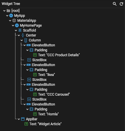
Example of the widget tree
The purpose of using widgets
Flutter provides a wide variety of widgets to choose from when building your app. They have multiple functionalities. Using a modular approach enables you to create UI elements that you can use in different views of the app. You can customize their appearance and functionalities later, according to your needs. This allows you to use such widgets many times across multiple screens and apps.
Each widget has a different role. Some are responsible for placing other widgets in a certain order. Others are meant to display images from the system folders. It can be easily said that widgets describe data that you want to present to users or receive from them.
Types of widgets in Flutter
Flutter offers ready-to-use widgets that correspond to different UI requirements.
There are two main types of widgets:
- StatelessWidgets – represent widgets that are immutable and don’t change their state by themselves. In other words, they are blocks that don’t require any user interaction or dynamic updates.
- StatefulWidgets – widgets that can change their state during runtime. Every input or visual element that relies on user interaction will be in this category.
According to the official segmentation in the Flutter documentation, widgets are also classified based on their usage:
- Accessibility – with their help, the app can be accessible to people with disabilities.
- Animation and Motion – they allow you to make the app more interactive thanks to animations.
- Assets, Images, and Icons – they are used to manage assets and display images and icons.
- Async – such widgets enable you to interact with users asynchronously.
- Basics – it’s a bundle of necessary widgets that every developer can use to build the ones that are more complex.
- Cupertino – widgets designed for iOS.
- Input – they handle all input you want to gather from users.
- Interaction Models – use them when you want to detect and handle user interactions via touch events.
- Layout – widgets responsible for arranging other widgets in a certain way (such as rows or columns).
- Material Components – a counterpart of Cupertino for Android; these widgets follow Google’s Material Design principles.
- Painting and Effects – widgets that apply visual effects to children without affecting their layout, size, or position.
- Scrolling – a category that enables users to scroll a set of widgets that are not scrollable by default.
- Styling – useful when you want to change the theme of UI, manage the responsiveness of your app, or adjust the sizes of widgets.
- Text – category with widgets used to display and style text.
Each of those categories contains multiple widgets. The ones below are elementary, and most software developers are familiar with them:
- Text Widget
- Container Widget
- Image Widget
- Center Widget
- Column and Row Widget
If you nest these blocks as child widgets for one another and use style properties, you can create a visual representation of your concept.
Now, let’s have a look at some eCommerce apps to find out how Flutter widgets work in practice.
Examples of widgets in mCommerce apps
Each layout or feature presented below can be created in many different ways. The code I share with you is simplified and only presents my propositions for solutions. There are other approaches that might work out as well.
Ikea
In mCommerce apps, it is essential to display products in an eye-catching way. As a result, customers get more interested in the offer. Ikea home screen is full of inspirations on interior design.
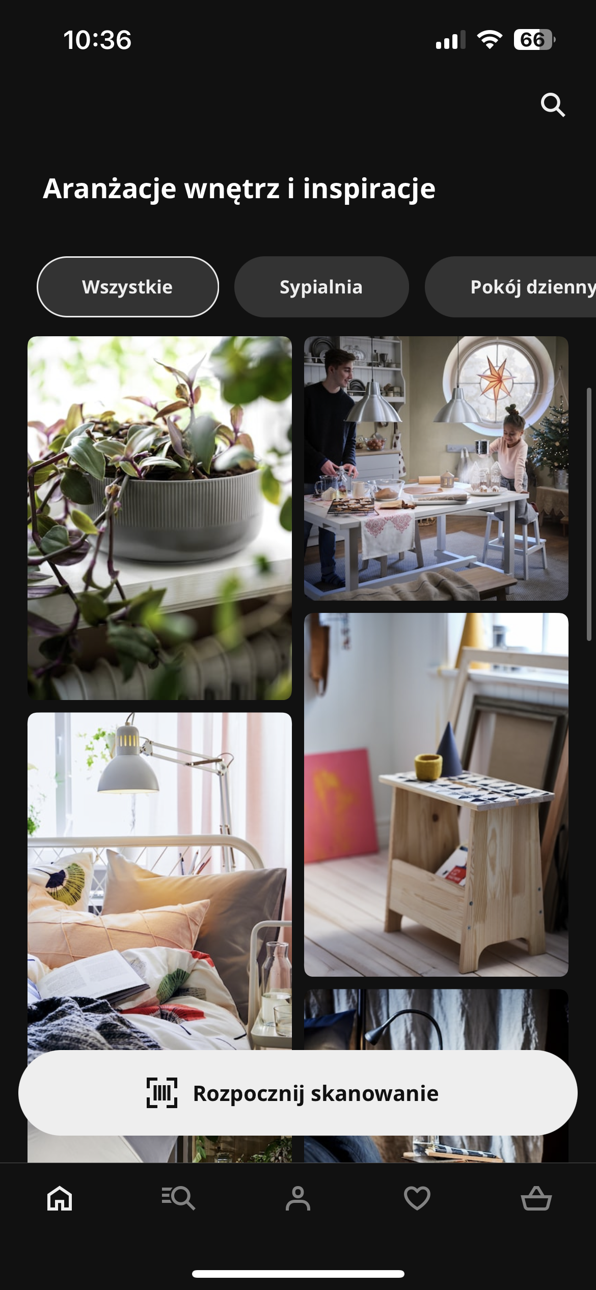
Image source: Ikea app
Besides a barcode scanner that facilitates shopping in on-site stores, users see images on a clean grid.
How to create such a view with Flutter widgets? First, list its elements – write down the description of what should be displayed on the screen and how users can interact with it.
Below, based on the picture, you can list what results are expected, write down filters with tags for each room, and add a grid of pictures with inspirations. Users should be able to scroll through the section with filters both horizontally and vertically. So in the filter section, we need a way to scroll content individually sideways while the rest of the elements must be scrolled up and down.
Implementation
I wanted to make it as detailed as possible, so I skipped text and filters and moved straight to the basic element of the widget used. As you can see, it’s not symmetrical. This leads to issues with GridView because it builds the grid symmetrically. Hence, my suggestion is to use a staggered grid.
Here is a package that tackles this issue. It offers us different possibilities for building interestingly looking grids.
Note The code is available on Holdapp Github.
MasonryGridView.builder(
       shrinkWrap: true,
       itemCount: 100,
       physics: const NeverScrollableScrollPhysics(),
       gridDelegate: const SliverSimpleGridDelegateWithFixedCrossAxisCount(
         crossAxisCount: 2,
       ),
       itemBuilder: (context, index) => Padding(
         padding: const EdgeInsets.all(2),
         child: Container(
           decoration: BoxDecoration(
             borderRadius: BorderRadius.circular(12),
             color: [
               Colors.blueGrey,
               Colors.greenAccent,
               Colors.redAccent,
               Colors.white54,
               Colors.lightBlueAccent,
             ][index % 5],
           ),
           height: [
             100.0,
             150.0,
             50.0,
             200.0,
             300.0,
           ][index % 5],
         ),
       ),
     )
Due to the fact that this constructor offers scroll functionality out of the box, we need to set its physics to NeverScrollableScrollPhysics to disable it. This allows us to use SingleChildScrollView alongside Column widget for the purpose of layout.
If you noticed the shrinkWrap property set to true, don’t worry – it’s not the same as the ListView property. The documentation says that: “This constructor is appropriate for grid views with a large (or infinite) number of children because the builder is called only for those children that are actually visible.”
The result should look like this:
What if the list is infinite and requires pagination? In this case, I would suggest using Slivers as it gives you more options when it comes to scrolled layouts.
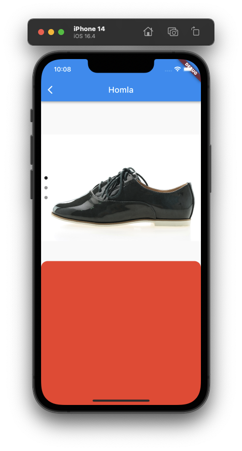
Homla
The original Homla app was written in native languages – Kotlin and Swift. Nevertheless, we can try to imagine what it would be like to build one of its coolest features with Flutter.
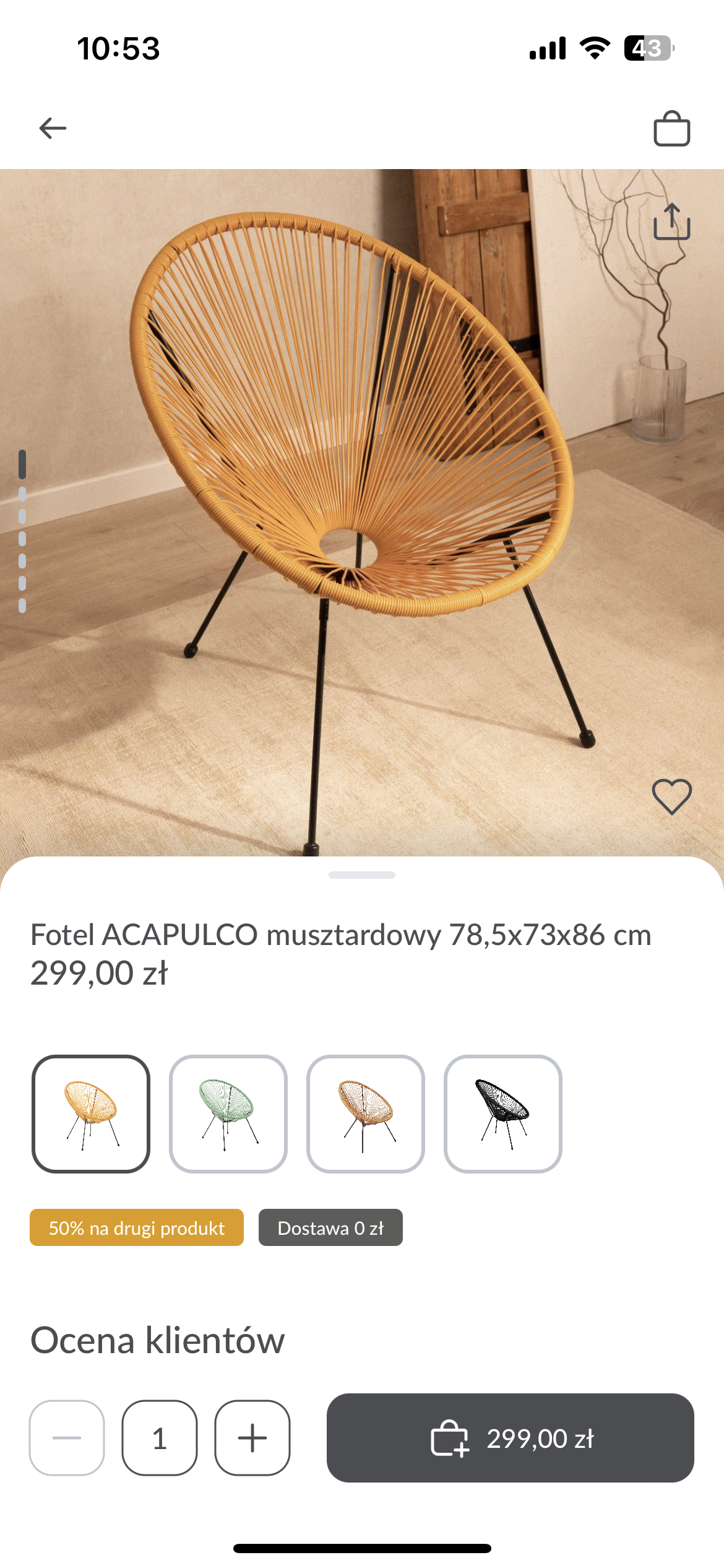
Image source: Homla app
We are going to focus on the product view because it uses nested scrolling in an uncommon way. For the purpose of this article, I’ll call it split scrolling.
The idea behind this feature is simple – in one view, users scroll the content in two ways. In the upper section with product images, they scroll the photos from up to down. But when they go to the section below (with product details), it expands to the whole screen after the tap.
Split scrolling in Flutter
First, make a list of elements that should be placed in every section on the screen. Then, write down what you are going to implement in this short demo.
As you can see, the image is overlapped by a small trailing from the details section. Besides it, we have CTA buttons and an indicator that tells us which image we are currently viewing. Nothing is extraordinary in the details section, so in our demo, we’ll replace it with a colored pane.
To sum up, for these two elements, we need a scrollable parent that can handle a scrollable child.
To solve this problem, you need to get back to Slivers and use CustomScrollView to implement your base page scrolling. Then, move on to the upper part of the screen, with product images.
This right-left scrolling behavior is widely used in Flutter apps. The easiest way to implement it is to use PageView. You need to remember that the scroll parent accepts Slivers instead of Widget, so you need to use SliverToBoxAdapter.
The remaining free space will be dedicated to the section with product details – which is just a colored pane, in our case. In order to create it, it would be best to use one of the two slivers we have in Flutter. I’ve chosen SliverFillRemaining to build this color pane but it can be easily done with a box adapter as well.
Take a look at a simplified result and code:
CustomScrollView(
         slivers: [
           SliverToBoxAdapter(
             child: Stack(
               alignment: Alignment.bottomCenter,
               children: [
                 const _ProductView(),
                 Container(
                   decoration: const BoxDecoration(
                     color: Colors.red,
                     borderRadius:
                         BorderRadius.vertical(top: Radius.circular(16.0)),
                   ),
                   height: 32.0,
                 )
               ],
             ),
           ),
           SliverFillRemaining(
             child: Container(
               color: Colors.red,
               height: MediaQuery.of(context).size.height / 2,
             ),
           ),
         ],
       ),


class _ProductView extends StatefulWidget {
 const _ProductView();


 @override
 State<_ProductView> createState() => _ProductViewState();
}


class _ProductViewState extends State<_ProductView> {
 final PageController _pageController = PageController(initialPage: 0);
 int _activeIndex = 0;


 List<Widget> get productPhotos => [
       Image.asset(
         'assets/shoes.jpg',
         fit: BoxFit.contain,
       ),
       Image.asset(
         'assets/shoes.jpg',
         fit: BoxFit.contain,
       ),
       Image.asset(
         'assets/shoes.jpg',
         fit: BoxFit.contain,
       ),
     ];


 @override
 Widget build(BuildContext context) => SizedBox(
       height: MediaQuery.of(context).size.height / 2,
       child: Stack(
         alignment: Alignment.centerLeft,
         children: [
           PageView.builder(
             controller: _pageController,
             onPageChanged: (page) => setState(() => _activeIndex = page),
             itemCount: productPhotos.length,
             itemBuilder: (context, index) => productPhotos[index],
             scrollDirection: Axis.vertical,
           ),
Column(
             mainAxisAlignment: MainAxisAlignment.center,
             children: List.generate(
               productPhotos.length,
               (index) => _dot(_activeIndex == index),
             ),
           ),
         ],
       ),
     );


 Widget _dot(bool isPicked) => Padding(
       padding: const EdgeInsets.all(8.0),
       child: Container(
         decoration: BoxDecoration(
           borderRadius: BorderRadius.circular(4.0),
           color: isPicked ? Colors.black87 : Colors.black38,
         ),
         height: 8.0,
         width: 8.0,
       ),
     );


 @override
 void dispose() {
   _pageController.dispose();
   super.dispose();
 }
}
CCC
This app caught my eye because of its two features. I’ve seen them many times on web apps, but it was thanks to CCC that I first saw how to use them in a mobile app as well.
Carousels
The first feature is infinite carousels. When users scroll their content, the app displays the next elements. For example, a banner with info about discounts, products, etc.
You can add such a carousel to your Flutter app. There are ready-to-use packages created specifically for this purpose, you don’t have to code it yourself. However, if you don’t want to use them, my suggestion is to create a PageView operated with Timer. It automatically handles animating to the next page after a settled time. The end of the animation triggers the append and removal of the first element of the list.
I chose the package called carousel_slider. It offers many options that alter the appearance of carousels. I’m pretty sure it will come in handy in most use cases.
Source: CCC app
This implementation is really straightforward. You just need to set the time after which the new item should appear and the percentage of the screen that this tile must take. Then, supply children for the carousel to build the list.
CarouselSlider.builder(
           itemCount: 3,
           itemBuilder: (context, itemIndex, pageIndex) => Padding(
             padding: const EdgeInsets.only(left: 16.0),
             child: Container(
               color: [
                 Colors.red,
                 Colors.blue,
                 Colors.green,
               ][itemIndex % 3],
             ),
           ),
           options: CarouselOptions(
             autoPlay: true,
             viewportFraction: 0.7,
             disableCenter: true,
             padEnds: false,
             height: MediaQuery.of(context).size.height / 2,
           ),
         ),
These few lines of code can create an effect that encourages the customer to look again at something you want to show them.
The result should be similar to this:
Complex scrolling effect: parallax
Now, let’s proceed with the most complex example of all. You’ll find this scrolling effect – parallax – in the section with product details.
Once again we will use Slivers, but this time with animation. This allows us to control the items displayed on the screen in relation to the scrolling progress.
First, take a look at the feature to see what needs to be implemented:
- All things in the top section can be scrolled in different directions.
- Buttons go sideways.
- The image seems to be sliding at a different pace compared to the rest of the elements.
This kind of behavior is called the parallax effect. It will just apply to the indicator and the image. They are the only ones scrolling on top of each other in one axis, so this is the only place where this effect will be visible. For an icon, you will mainly rely on the offset to move it on another axis. To implement it, you need to create an animation that gives the children different speeds when users are scrolling.
Start with using a scrollable widget. You also need a way to control the following:
- Picture
- Indicator
- Icons
To control their position, you can use Stack and exactly Positioned widget. The next thing to do is to set up the values that control the widgets.
 final ScrollController _scrollController = ScrollController();
 final PageController _pageController = PageController();
 double get screenHeight => MediaQuery.of(context).size.height;
 double get scrollingOffset =>
     _scrollController.hasClients ? _scrollController.offset : 0.0;
Now, you need to determine where you are in your scrolling. For this reason, use the offset operator. MediaQuery will get the info about the height from the device.
To proceed, we need two elements. A scrollable widget with space for product images and a list of tiles with detailed info. For the purpose of this example, we are going to simplify this list.
Widget _productDetails() => ListView(
       cacheExtent: 64,
       controller: _scrollController,
       children: [
         /// Space that we want our product in
         SizedBox(height: screenHeight * 0.35),
         ...List.generate(
           10,
           (index) => Container(
             height: 100,
             color: [
               Colors.red,
               Colors.blue,
               Colors.green,
             ][index % 3],
           ),
         )
       ],
     );
Supply this code to the stack along with the widget to control the icon behavior.
Widget _actionIcon() => Positioned(
       top: screenHeight * 0.2 + kTextTabBarHeight - scrollingOffset,
       right:
           16 - scrollingOffset * 0.25,
       child: IconButton(
         onPressed: () => setState(() => _isFavorite = !_isFavorite),
         icon: Icon(
           _isFavorite ? Icons.favorite : Icons.favorite_border,
           color: _isFavorite ? Colors.red : Colors.black,
         ),
       ),
     );
You can animate the icon, so it will slide out of the screen. Just change the position of the right padding, based on the offset.
Now, let’s do the same with the photo and indicator by incorporating the scrolling offset.
Widget _productPhotos() => Positioned(
       top: -0.6 * scrollingOffset - kToolbarHeight,
       right: 0,
       left: 0,
       height: screenHeight * 0.35,
       child: RepaintBoundary(
         child: PageView(
           onPageChanged: (page) =>
               setState(() => _currentProductPhoto = page),
           controller: _pageController,
           children: productPhotos,
         ),
       ),
     );


 Widget _productPhotoIndicator() => Positioned(
       top: screenHeight * 0.25 + kTextTabBarHeight - scrollingOffset,
       left: 0,
       right: 0,
       child: Row(
         mainAxisAlignment: MainAxisAlignment.center,
         children: List.generate(
           productPhotos.length,
(index) => _indicatorDot(index),
         ),
       ),
     );


 Widget _indicatorDot(int index) => Padding(
       padding: const EdgeInsets.symmetric(horizontal: 8),
       child: InkWell(
         onTap: () => _pageController.animateToPage(
           index,
           duration: const Duration(milliseconds: 300),
           curve: Curves.easeIn,
         ),
         child: CircleAvatar(
           radius: 8,
           backgroundColor:
               index == _currentProductPhoto ? Colors.black : Colors.black12,
         ),
       ),
     );
After adding it all up to the Stack, you should see this result:
Image source: CCC app
As you can see, the scroll behaves differently on each of the elements. With this simple manipulation, you created a neat effect that can enhance the user experience.
In conclusion, widgets are the backbone of Flutter app development, enabling developers to create stunning and interactive user interfaces. With a wide range of widgets available, developers can customize and build complex UIs. This base constantly grows thanks to the community with their packages that contain even more options to choose from.
By understanding the different types of widgets and learning how to create or combine them together, developers can unlock the true potential of the Flutter application. So, I encourage you to dive into the world of Flutter widgets and unleash your creativity!
Good to know: Building user interfaces with ready-made widgets in Flutter demonstrates how a modular approach accelerates a developer’s work. At Holdapp, we apply this exact same philosophy to the entire software architecture. Check out how our solution, Rappid Workflow, to see how constructing apps from pre-built logical components can cut your project’s time-to-market by weeks.


