Android Small Talks: CoordinatorLayout, or one of the strengths of Android Design Support Library

When Android Lollipop entered the market, there was a breakthrough. Google provided us with an extensive library of Android Design Support Library which facilitates creating applications that are compliant with the principles of Material Design. Creating a user interface in accordance with these guidelines introduces our software to the next level of design and user-application interaction.
Material Design focuses, among others, on creating beautiful animations, designing particular elements, but above all on consistency of all components. Considering these factors, it is not surprising that CoordinatorLayout was also introduced. This Layout is a new kind of container that is a FrameLayout further enhanced with the ability of creating dependencies between elements which are its children.
How to use CoordinatorLayout?
Using CoordinatorLayout is not at all complicated. Just put in it the views, which are to be included in the container, just like in any other case. Then add to them appropriate behavior.
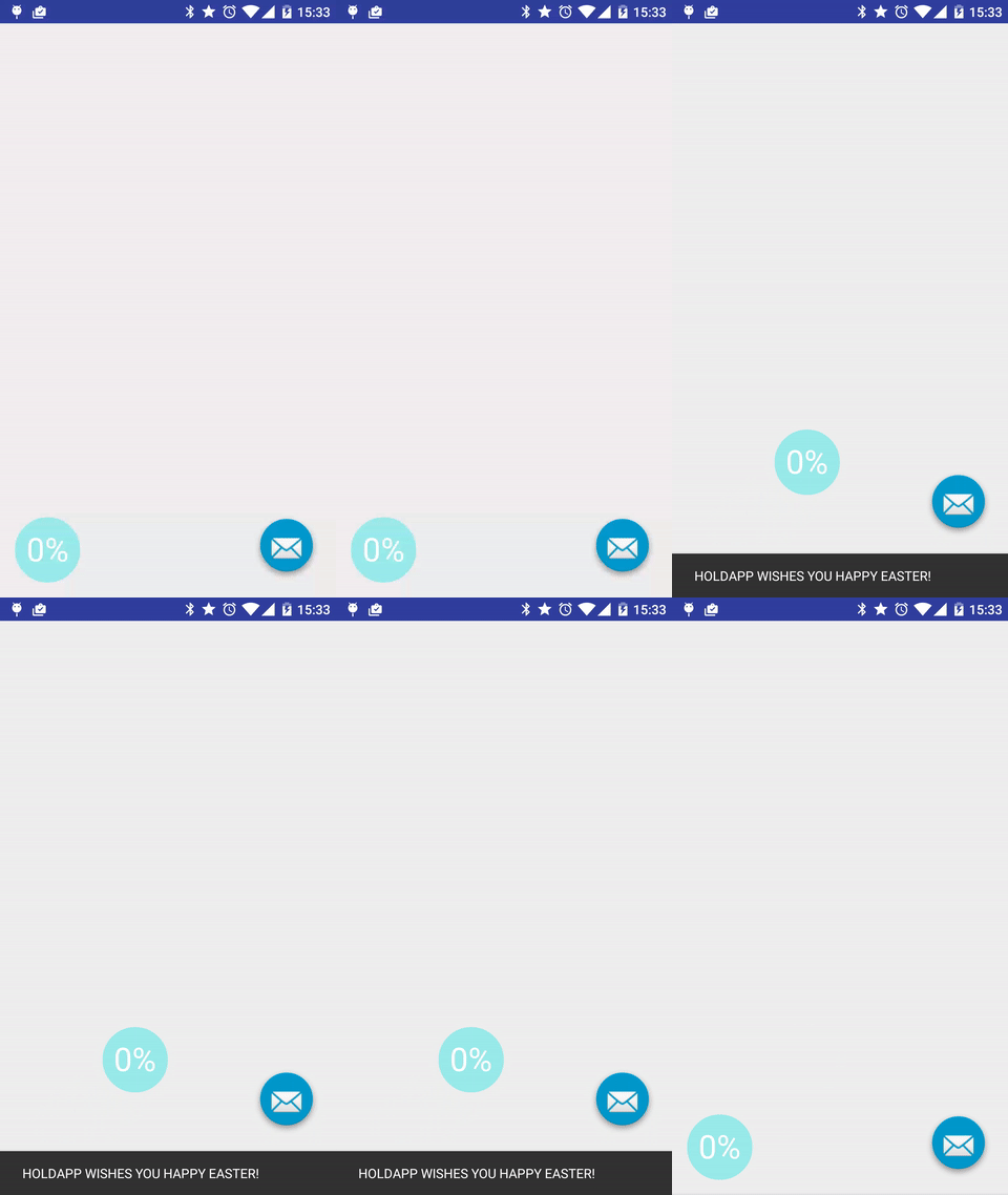
Below you can see an example of creating a dependency of two components whose behavior is to be similar to the action of FloatingActionButton dependent from appearing SnackBar. One of the components is FAB from open source library, and the other is a self-created simple view, which was given similar behavior.
Add the library
In the first step we need to add Support Design Library to Gradle:
compile 'com.android.support:design:23.1.1'Create a layout
Then, we need to create our layout with 2 components in XML. The final file looks like this:
<android.support.design.widget.CoordinatorLayout
	xmlns:android="http://schemas.android.com/apk/res/android"
	xmlns:app="http://schemas.android.com/apk/res-auto"
	xmlns:tools="http://schemas.android.com/tools"
	android:layout_width="match_parent"
	android:layout_height="match_parent"
	tools:context="com.example.dominika.coordinator.MainActivity">

	<com.getbase.floatingactionbutton.FloatingActionButton
    	android:id="@+id/lib_fab"
    	android:layout_width="wrap_content"
    	android:layout_height="wrap_content"
    	android:layout_gravity="bottom|end"
    	android:layout_margin="@dimen/fab_margin"
    	android:src="@android:drawable/ic_dialog_email"
    	app:layout_behavior="com.example.dominika.coordinator.FloatingButtonBehavior"
    	/>

	<com.example.dominika.coordinator.CustomView
    	android:id="@+id/customView"
    	android:layout_width="70dp"
    	android:layout_height="70dp"
    	android:layout_gravity="bottom|start"
    	android:layout_margin="@dimen/fab_margin"
    	/>
</android.support.design.widget.CoordinatorLayout>
What’s interesting to us is adding behavior of lib_fab view:
app:layout_behavior="com.example.dominika.coordinator.FloatingButtonBehavior"To make this possible we need to take the next step, that is define behavior of a component used with an external library.
Adding view behavior
We do it by creating a new class. First of all, we should make sure that the class inherits from the Behavior class. In order to enable adding behavior by .xml file we need to create a builder with two arguments: AttributeSet and Context.
public class FloatingButtonBehavior extends CoordinatorLayout.Behavior<FloatingActionButton> {
	public FloatingButtonBehavior(Context context, AttributeSet attributeSet) {

	}
}
The next step is to override the method layoutDependsOn() and define which events we want to listen to. In this case, we are interested in appearing SnackBar.
@Override
	public boolean layoutDependsOn(CoordinatorLayout parent, FloatingActionButton child, View dependency) {
    	  return dependency instanceof Snackbar.SnackbarLayout;
	}
Then we need to override the method onDependentViewChanged(), which specifies what is to happen with our view when the event we are listening to occurs. In our case, the view behavior which we add will be moving depending on SnackBar. In this method, we can read the current state of dependent view. Our goal is to move the view upwards, exactly by the height of the element on which it is dependent so we need to translate it along Y axis:
@Override
	public boolean onDependentViewChanged(CoordinatorLayout parent, FloatingActionButton child, View dependency) {
    	float translationY = Math.min(0, dependency.getTranslationY() - dependency.getHeight());
    	child.setTranslationY(translationY);
    	return true;
  	}
At the same time an element that is important here is the return value. This value should always be true when the view changes its position on the screen.
So created behavior we can set in the view through an .xml file.
Adding behavior through an annotation
Besides adding dependencies in an .xml file, when we deal with our own view, we can add to it default behavior created by us. It can be done in a very clear way by adding annotations.
For this purpose there was created a similar class that defines behavior of a view. However, to enable creating annotations we must first add a constructor which doesn’t accept arguments:
public class CustomBehavior extends CoordinatorLayout.Behavior<CustomView> {
	public CustomBehavior() {}
When a class defining response of a view is ready, just add an annotation to your own view:
@CoordinatorLayout.DefaultBehavior(CustomBehavior.class)
public class CustomView extends View {
That’s it! In this way, any CustomView view we create has automatically defined behavior. You can see the result below:

To sum up, CoordinatorLayout is a Layout which enables easy creating of dependencies between its children. Thus it is another well-thought element of the library of Android Design Support Library. As shown, the whole process is simple and requires only following a few rules. Obviously, you will understand it best if you write something yourself, so I encourage you to test CoordinatorLayout on your own! 😉


